Borrowing its design from the codex, the site arranges its materials in the form of a table of contents, which appears immediately following a brief address to the reader (scroll down for table of contents--note the message content which precedes it). The table represents a recursive sequence, with contemporary items strategically placed at both the beginning and the end. This permits the chronological reconstruction (representing the "inner" chapters) to comment on the present, reinforcing the humanistic themes of the site.
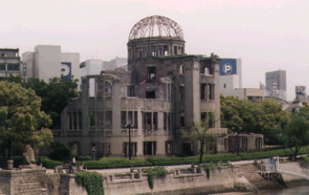
In terms of mobility, the learner may enter individual locations within the home page, but there is no opportunity to leap from chapter to chapter. The links contained within individual collections are largely of a hypotactic nature, serving to illustrate a point before allowing the learner to return to the previous spot. The governing structure as described here encourages a linear reading of the materials, browsing from beginning to end with little initiative on the part of the learner. Significantly, the image of Hiroshima Tower (destoyed in the bombing, but left to stand as a reminder) appears in multiple exposures from different periods of time, cementing the connection between 1945 and 1995.

Next / Table of Contents